Read this story and more on my medium page: https://samiwurm.medium.com/ !

Visualization of the Effects of Climate Change
When tasked with looking for recent data visualizations that have been impactful to our population, I immediately thought of climate change. There have been countless predictions and evaluations of the general populous’s feelings toward climate change this year- each trying to underline the seriousness of the problems we are facing and evoke action from our citizens. Some visualizations have done a great job at emphasizing the time sensitivity of the pressing effects of climate change, such as the NYC Metronome, which displays the time counting down the “critical window for action to prevent the effects of global warming from becoming irreversible.” Others, however, have been less effective in clearly expressing the current sentiments held about climate change and the importance of addressing this issue immediately.

NYC Metronome
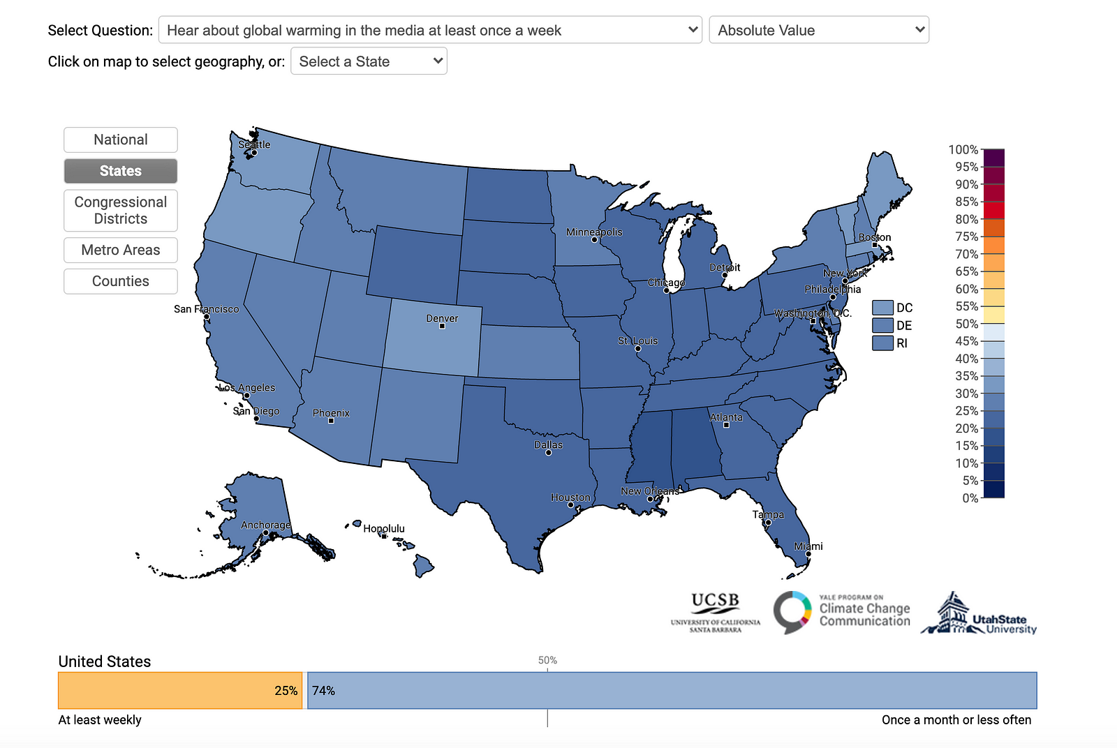
One visualization that I viewed was released on September 20, 2020 by the Yale Program on Climate Change Communication. They estimated public opinion data “ using a statistical model based on national survey data (n > 25,000) gathered between 2008 and 2020,” where they collected responses to statements ranging from “agree” or “support” to “disagree” or “oppose.” I looked at each of the questions explored given their data and came upon the following graph:

Figure 1.0: Yale Climate Opinion Maps 2020
The Yale Climate Opinion Maps 2020 explored a lot of different questions about Environmental Change with its participants, and mapped their data to graphs like the one above showing the general sentiment in regard to the statements given in each state/county/region/etc. The depth of their study and the various methods that they gave to represent their data (horizontal bar-stack, labeled map, gradient vertical display) allow for a thorough analysis of the population’s feelings toward climate change. Also, their spacing allows for a clear reading of the graphs displayed, as it aligns with the Gestalt Principles of design and makes each individual figure on the page ‘pop.’ However, given the nature of this graph/color scheme and the statement at hand in Figure 1.0, I do not feel that this visualization is telling a complete story.
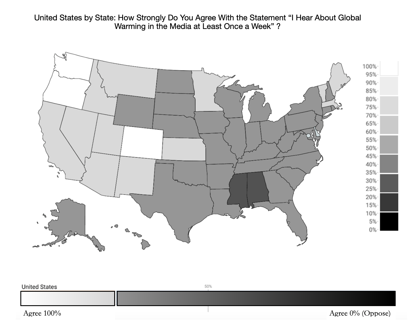
I believe that the rhetoric framing of this visualization was meant to enforce the view that we do not hear or talk about global warming enough; however, the map was too confusing to look at for viewers to immediately receive that message. In order to address the confusing aspects of this graph and perhaps frame this data more in-line with the data visualization principles that we have been learning, I created the following remake of this visualization:

Figure 2.0: A New Representation of the Data from Figure 1.0
The first change that I made to the graph was its color scale. As the responses in the data collected range from 0–100 on a scale from Disagree to Agree, I feel that the use of a divergent color scale for the percentages on the side of the original graph is inappropriate, as this type of scale usually represents an even variance from a zero point value in either direction. Furthermore, to choose a divergent scale using red and blue, the colors of America’s two large political parties, certainly seems to make a statement and add meaning to a map of the states. However, there is no added meaning here, as Democrats do not tend to think that they do/should talk about climate change less than Republicans, so this added implication only contributes to the user’s confusion.
To convey the information in a more straight-forward way, I implemented a Sequential Grayscale that varies each section by luminance only — not by hue. The responses to the poll given represent a range of answers to the same question in which there is no middle ground to deviate from. Especially since the question at hand deals with the frequency at which responders discuss climate change, ranging from weekly to never, there is no “neutral response” in the domain of time. Also, I believe that it is a visually more powerful choice to have a sequential scale ranging from black-white showing how much Americans do or don’t agree with the statement at hand in order to vividly depict the feelings of the population.
To this point, it is important to remember that “if we pick the wrong color palette to represent our data, for any particular gradient the same sized jump between one value and another (e.g. from 0 to 1, as compared to from 3 to 4) might be perceived differently by the viewer.” By choosing to incorporate a color palette, the original map could have been obscuring the way that viewers see the size of each shaded state and therefore the way that individuals perceive the amount of people who care/don’t care about climate change. Finally, by getting rid of extraneous colors on the map, I increased the data-to-ink ratio and therefore made the map more easily comprehensible.

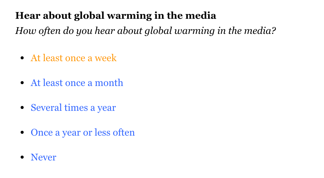
Figure 3.0: Wording of Questions in Data
The second change that I made to the original figure was the wording of the question at hand. I had to dig deep on Yale’s website to find the original question asked to their study’s participants, which was: “How often do you hear about global warming in the media?” I never would have known this just from looking at the visualization given. In fact, when I first looked at the image, I assumed the question asked to participants to be “How often should we hear about global warming in the media?” The responses to these two questions tell completely different stories: one about the present and one about the future. Therefore, I added a more precise title to my interpretation of the data to make clear to the audience what exactly they are looking at. Also, I added a gradient to the horizontal bottom bar displaying the results, to further enforce that the darker the state, the less likely that its citizens hear about climate change in the news very often. I believe that this re-interpretation of the data in Figure 2.0 makes it much more clear that the states in white are outliers, thus making it more clear that it is uncommon for most states to have citizens who currently discuss climate change on a regular basis.

Intended Audience for Visualization: Everyone.
Moreover, analysis of the data aside, I would like to also touch on the accessibility of Figure 1.0. I can only assume that the intended audience for this initial visualization was everyone; however, the original figure at hand leaves some citizens out of the conversation. Color blind citizens, of course, are at a disadvantage viewing a color coded map of the states. But also, this opinion map can only be found on the website of Yale’s Program for Climate Change, is not mobile friendly (does not show full maps on phone screens), and comes up only in searches for those already looking for climate data or scholarly articles (surrounded by many other articles about the importance of caring for our planet). Therefore, it seems that in reality this data is only going to be seen by educated people who most likely already care about climate change. This is unfortunate because those who need to be reminded most of the impact that we have on our planet, and of the reality that (as shown in Figures 1.0 and 2.0) not nearly enough of our population is currently discussing climate change on a regular basis, are those who will never come across it.
Changing the wording and color scheme of the map were good first steps to make it more accessible to those who cannot see a full range of colors or do not have in-depth information on what was being asked in the study, but for this information to be made more accessible to all citizens, more steps must be taken. For example, making this website mobile-friendly would make this information available to many more Americans, considering 96% of Americans own a smartphone as of 2019 and the population is becoming gradually more dependent on our phone’s for news sources. Furthermore, the majority of people who do not have access to other technology devices and rely on their cellphone for information “tend to be younger, are less likely to be white and have lower levels of education than those who mainly use several other platforms.” These groups of people are not currently being considered in the distribution/representation of Figure 1.0.

Data Accessibility
In order to reach a more diverse audience of Americans with all backgrounds and views, this visualization should be made mobile friendly and should show up in places that one might not already be looking to read about climate change (for example, on social media, or alongside opposing articles). When the visibility of a visualization like Figure 1.0 is increased, its effects become much more wide-reaching. I propose the above redesign/redistribution of the visual presented in Figure 1.0 because I know that it is imperative that we, as world citizens, take action against climate change immediately in order to protect each other and our planet. Therefore, it follows that it is imperative to make visualizations about climate data as easily comprehensible and as far reaching as possible.