Design Repository Link: https://docs.google.com/document/d/1LPRySrbLiFH2RDUxulZQAJUk1wdku5PyK3SxiivU8wY/edit?usp=sharing
Overview
For the Design for Expression/Creativity project, our team was told to build an interaction utilizing 3D user space in a way that feels more expressive than mouse or keyboard. We wanted to design an application that combined the learnings from class with a creative cultural reference. After investigating 3D user interfaces and technologies that enable us to incorporate body movement with objects in an application, our team began to think about ideas that would be nostalgic. Initially, we saw an opportunity to use p5.js, a javascript library that allows for graphic and interactive experiences. The opportunity to create shapes and move objects prompted brainstorming for what our Design for Expression/Creativity project should be about. With that being said, we continued to explore the possibilities highlighted in the p5.js reference guide and functions to not only create the graphics but also to implement body functionalities within the application.
Ideation Phase

When we were first introduced to this project, our group was inspired by two P5 pieces that we thought we could combine artfully. Teachable Machine (Figure 1.1), which takes in information from the camera and classifies what it sees as either day or night, and Drawing Circles (Figure 1.2), which allows users to move their mouse around the screen creating circles of different size/opacity. The color and style of the circles along with the idea of classifying different visual elements on screen drew all of our minds towards none other than Avatar the Last Airbender!


The image of moving circles around the screen reminded us of airbending (Figure 2.1) and the way that the elements look as they leave benders’ fists in this classic show. Further, we thought that since the four elements (fire/water/air/earth) are so distinct, we could use the same concept as the teachable machine example to take in information from the screen and classify our user as a certain type of bender. An example of how different bending the various elements appears can be seen as we compare Figures 2.1 and 2.2 above.
Implementation Phase
https://cdn.embedly.com/widgets/media.html?src=https%3A%2F%2Fwww.youtube.com%2Fembed%2Flob74HqHYJ0%3Ffeature%3Doembed&display_name=YouTube&url=https%3A%2F%2Fwww.youtube.com%2Fwatch%3Fv%3Dlob74HqHYJ0&image=https%3A%2F%2Fi.ytimg.com%2Fvi%2Flob74HqHYJ0%2Fhqdefault.jpg&key=a19fcc184b9711e1b4764040d3dc5c07&type=text%2Fhtml&schema=youtubeFigure 3.0- PoseNet
To enhance the way that we could use visual data to classify our users, we looked to PoseNet, a machine learning extension of JavaScript using ML5 that traces the position of the user’s body on camera and classifies their position based on the placement of their head/torso/limbs. We decided to create a pose for each different element (air/fire/water/earth) that would activate the user as a bender of that specific type of element. Then, when the user moved their hands around the screen, particles of their element would move around the screen, following their hands in a similar style/look to the circles from Figure 1.1.

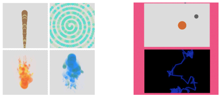
In the first iteration of our game, all of the elements presented in the circular style from our original inspiration (Figure 4.1). However, after our first demonstration of the app to users, when we ran a Wizard of Oz Demo with a focus group, users wanted more variety in their experience. The original design was working really well for the element fire, but needed to be altered for the others. Therefore, we changed the other elements to appear more fluid and versatile, while still following the Gestalt Principles of continuity, closure, proximity, figure/ground; therefore ensuring a diverse yet overall enjoyable user experience for each of the different elements. For example, the water element (Figure 4.2; bottom) utilizes the principle of continuity and figure/ground as it flows steadily in front of the user as they bend, easily followed by the eyes and entertaining. The earth element on the other hand (Figure 4.2; top) utilizes the principles of closure, proximity, and figure/ground as the rocks in that type of bending are no longer directly connected: their connectedness and reactivity to the user are conveyed through the user’s ability to imply closure between the rocks and to link their meaning through proximity and prominence in the foreground.
Iterations of Product

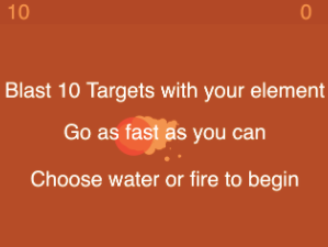
Another element of our application that we wanted to include was an accumulation of points based on targets that would pop up on the screen and get hit by the elements being directed around the screen by the user (Figure 5.0). For our Wizard of Oz demo, this was conducted via mouse by a controller. The users seemed to like this idea and the sense of reward that came with hitting a target, but again wanted more exciting visuals.

Therefore, we decided to experiment with different visuals. Here, we can see Azula, an antagonist from Avatar the Last Airbender, who we used the image of and programmed to move around the screen, dodging attacks from the user (Figure 6.1). In the end, we used different visuals for each element: a fire ball for the fire element, pillars of earth for the earth element, and simply air/water for the air/water elements. This choice seemed to fit with the theme of training as a bender in our application and matched our needs-finding goal of creating an interactive bending experience. Finally, we added some East/South Asian inspired music to the application to play in the background of the user’s experience, to match the cultural inspirations of Avatar the Last Airbender, and solidify the environment of the design.
User Testing

Finally, we held a day of user testing (Figure 7.1) in which a sample group of Bucknell Students/Professors tried out the application! Overall, it was a great success. The users found that they struggled a bit with standing the correct distance from their camera in order for their poses/bending to be detected, but other than that reported a highly enjoyable experience that they would partake in again.
Strengths & Weaknesses of Design Process
Our final prototype had many strengths as well as many weaknesses. The effects used to represent each element are all fun to look at, as well as very distinct from one another. The idea was very creative, and was based off a show that is very special to a lot of people. Although the controls were a little finicky, you could generally get to see each of the elements very quickly. Although the user cannot move too quickly, the software is very good at following the movement of the user’s arms. However, one of the biggest weaknesses with our prototype is that it required a lot of space to use. You have to stand up and away from the camera in order for the machine learning to work properly, and have the space to move your arms around freely in order to see the appeal. Since the purpose of the program is to replicate different martial arts, it is unclear how much of this could be remedied with more time. What could certainly be improved with more time is the graphics that show the poses for each form of bending, as well as indicate what the current element is. Although the graphics communicate what it needs to effectively, a lot could be done to make it easier on the eyes.
Conclusion
In general, our team learned about the whole design process from ideating a product to development with iterations. There are definitely opportunities for improvement whether that is optimizing the graphics or improving the way the pose classification read body movement within a space. As a team, learning p5.js and its capabilities with user interfaces was a cool learning curve and being able to see the technologies come together and create a cultural product was a cool experience.