Continue Reading Here, or View Full Story on My Medium Page.
This past semester, I enrolled in a Human Computer Interaction course with Professor Evan Peck at Bucknell University. Throughout the course, while developing and exploring various new applications and technologies, we studied the design process. I learned exactly what it takes to make a piece of technology that humans can successfully and enjoyably interact with, and I would like to share that with you. Here are the Five Principles that I have decided are paramount in the design/innovation process.
1. Ideate Fearlessly

Picasso Painting
Personally, I struggle a lot with perfectionism. I think that this is a common trait in a lot of designers and computer scientists, and I know that it can sometimes feel scary to start a project when the path forward/end destination is unclear. That is why ideation is an instrumental part of the design process: Ideation dispels fear and allows for greater creativity. In What’s the Story: Essays about art, theater and storytelling, American playwright and author Anne Bogart puts the importance of diving into one’s ideas well:
If what Picasso proposed is true, that the first stroke on the canvas is always a mistake, it is best to get on with the mistake, without delay, earlier rather than later. Write one sentence, make one choice or point at something and say ‘Yes.’ And then, as the process unfolds, and as long as I keep at it and stay attentive and resolute, making adjustments to each mistake, things eventually fall into place.

Don’t Design in Fear!!
Rather than fearing mistakes or ‘silly’ ideas, we should use them! This realization transformed my creative approach throughout this semester of HCI as we had to dig deep to find the best ways to speak to different audiences through various mediums. We read Design Thinking, by Don Norman, and in Chapter Six he specifies the following guidelines for the ideation process:
1. Generate numerous ideas. It is dangerous to become fixated upon one or two ideas too early in the process.
2. Be creative without regard for constraints. Avoid criticizing ideas, whether your own or those of others. Even crazy ideas, often obviously wrong, can contain creative insights that can later be extracted and put to good use in the final idea selection. Avoid premature dismissal of ideas.
3. Question everything… A stupid question asks about things so fundamental that everyone assumes the answer is obvious. But when the question is taken seriously, it often turns out to be profound: the obvious often is not obvious at all.
Going into our class, I did not put enough focus on the early stages of my designs/projects. However, I have now learned the tremendous power in documenting small thoughts and ideas and nourishing them like seedlings. A brilliant invention can stem from a single notes doc, voice memo, sketch, photo, or tweet. For all of our projects this semester, we began working by sharing ideas, sketches, and photos with our teammates.
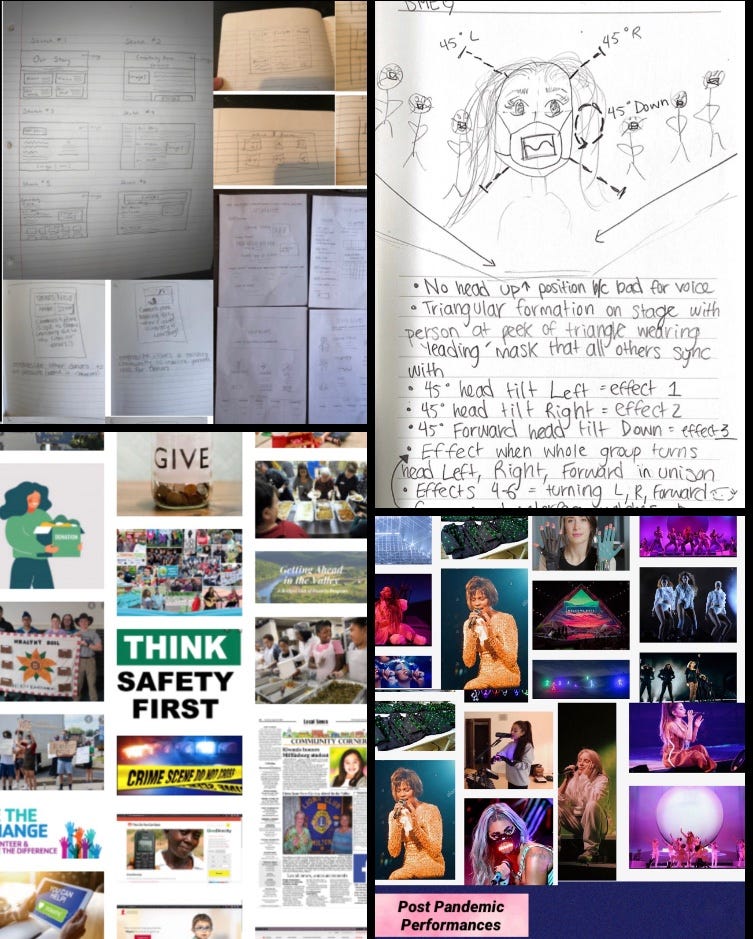
Sketches, Prototypes, and Mood Boards
These sketches and mood boards helped me hone in on what exactly I wanted to capture in my final products. The more you are able to define the aesthetic/uses/goals of your final product in the early stages of design by throwing possibilities out into the world, right in front of your eyes, the easier the building process will be.
The main takeaway here: Your ideas are valuable!!! Carry around a prototyping notebook always. Take pictures and collect evidence of things that inspire you. Make mood boards! There is no shame in having unpolished ideas. Every project starts somewhere.
2. Defy the Single Story
Design is a human process. A brilliantly designed piece of technology can be easily used by a wide range of people to enhance their life in some way. Therefore, we must not cater our creations to people who live and think exactly like us. We must be cognizant of the ways that our design choices elevate or demoralize different groups of users. Consider: Are you catering to those who might have different mental or physical abilities? Different backgrounds? Different levels of education? One TED Talk that we watched in class described how we might harm different user groups by portraying a ‘single story’ in our creations:
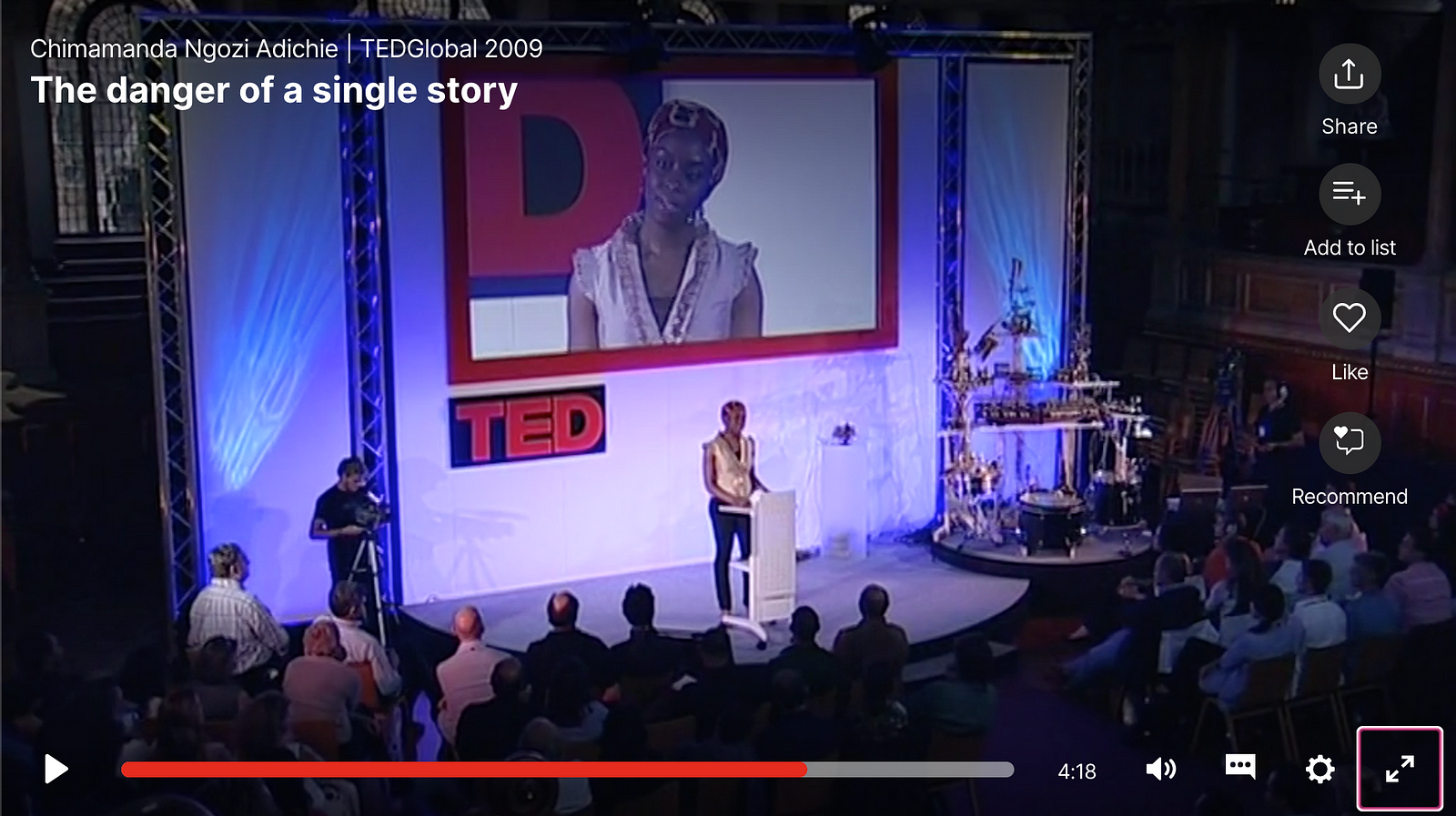
In this piece, Adichie discusses the challenges that she faced finding her story and her voice as a writer in Nigeria. The only stories that she read growing up were written by/for/about white people who lived complex, full lives. Then, when she found stories about Africa, they all focused on the single narrative that Africa is a ‘continent of catastrophes’ with struggling peoples. Adichie explains how she struggled to write well-rounded, joyous Nigerian characters because the literature that she consumed designed a single, demoralizing, incomplete narrative of her people that was ingrained in her mind. At the end of her talk she shares:
Stories matter. Many stories matter. Stories have been used to dispossess and to malign. But stories can also be used to empower and to humanize. Stories can break the dignity of a people but stories can also repair that broken dignity.
Our Stories Change the World
In the field of Human Computer Interaction, we hold the power to tell our users’ stories and to share diverse stories with them. Also, we have the responsibility to make sure that our creations are accessible to and representative of many different user groups. In my project Design and Redesign: Visualizing Climate Change, I engaged in discourse on the ways that the following data visualization fails to engage diverse audiences:
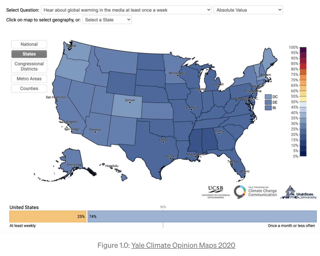
The original figure at hand leaves some citizens out of the conversation. Color blind citizens, of course, are at a disadvantage viewing a blue-color coded map of the states, differentiated by shade. But also, this opinion map can only be found on the website of Yale’s Program for Climate Change, is not mobile friendly (does not show full maps on phone screens), and comes up only in searches for those already looking for climate data or scholarly articles (surrounded by many other articles about the importance of caring for our planet). Therefore, it seems that in reality this data is only going to be seen by educated people who most likely already care about climate change. This is unfortunate because those who need to be reminded most of the impact that we have on our planet, and of the reality that not nearly enough of our population is currently discussing climate change on a regular basis, are those who will never come across it.
Engaging with computer artifacts like data visualizations with this principle of avoiding a Single Story in mind is incredibly powerful. If we think about the way that data has informed our emotions and actions in the last few months since the start of COVID-19, it is easy to see the effects of the stories that data portrays. Computer visualizations, apps, and devices can induce fear, sadness, and confusion. They can ostracize certain groups of people and increase the education gap. Or, if we enter the design process mindfully, they can be inclusive, uplifting, and beautiful.
Data is Beautiful 😀
The next time you find yourself developing an application, device, or data visualization, remember to do the following: Consider color blind individuals in visual choices. Consider blind folks when adding descriptions and alt text to images that a screen reader could clearly convey. Consider how you can combat the possible physical/mental challenges that are imposed by the set-up of your hardware or software.
Be a mindful and empathetic designer. Not only will your users appreciate it, but the world will be a better, safer place for it.
3. Research and Documentation are a Must
No matter what you are designing, I would highly encourage that you research the problem you are addressing beforehand and document the ways in which you address your findings in your work. Design is a growing field and we must help one another by adding to the internet’s shared repository of design findings/work.

We’re All in This Together, Designers
The first part of this principle involves researching the problem that you are trying to solve. This is very different than researching/considering the solution that you would like to offer, because design-thinkers must get to the root of users’ grievances before making any decisions about the product that they would like to make at all (therefore ensuring the most beneficial solution). For example, as Harvard Professor Theodore Levitt once pointed out,
People don’t want to buy a quarter-inch drill. They want a quarter-inch hole!
If, utilizing good design methodology, one were to figure out a more efficient way to carve out a quarter-inch hole, no one would ever ask for a quarter-inch drill again. I’m sorry to say it, but most users don’t care about your craft so much as they care about having their needs met. Therefore, good design is catered to users’ needs.
This principle was first addressed in my project Design for Others in which my group took a website whose UI could use fixing, and we redesigned it to cater to its audience’s values and needs.
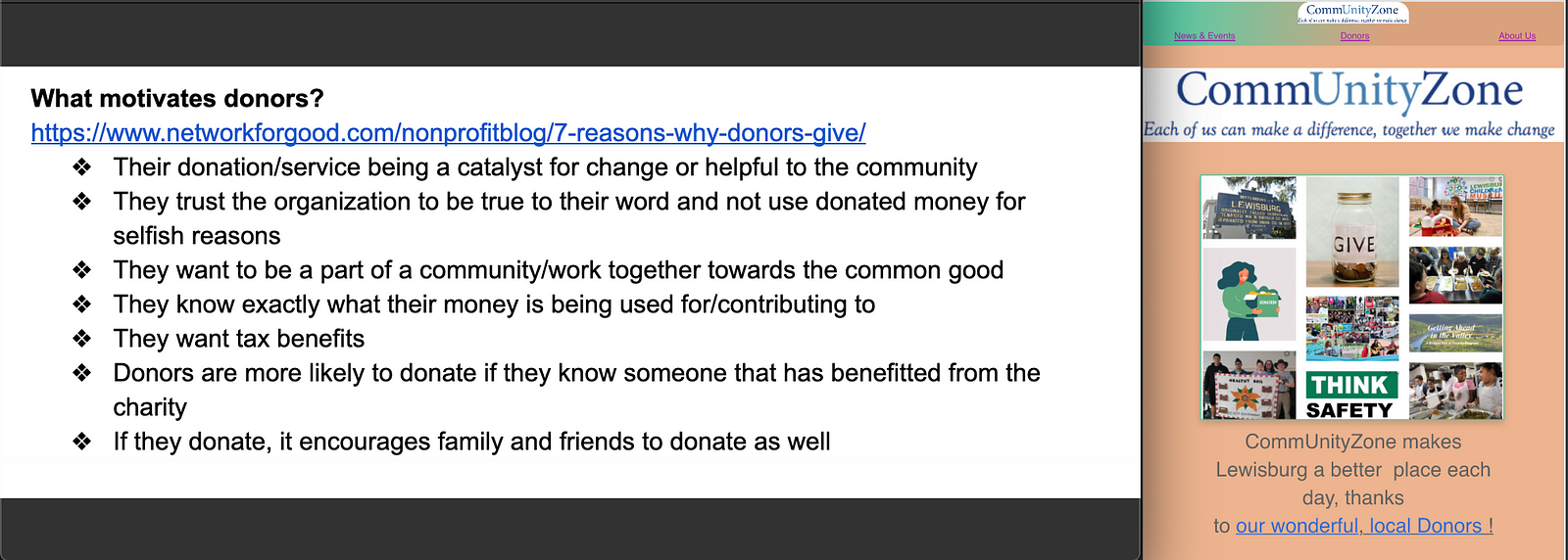
Community Zone Redesigned Website
For this project, we took a website for a local group that needed funding and catered their new UI towards the wants and needs of potential donors. I found this principle to be exceptionally helpful and carried it with me into my proceeding project such as the app that I created to get teens interested in pursuing careers in design: Design-High.
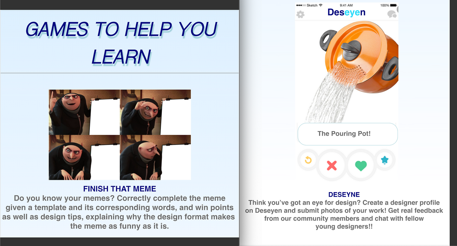
Key Features of Design High
After considering the wants/interests of teens, I decided to dedicate parts of the app specifically to games, memes, and a design-based social platform based on tinder. As silly as it might seem, teens certainly know about games, memes, and tinder. If I could relate to them by placing design principles in front of them in a format with which they are already comfortable, I see that as a win!
Share Your Findings 🙂
Once you’ve done the work to research and connect with users/find a solution to users’ problems- share it! If there’s one thing I’ve learned through reading/conducting user studies and testing this semester , it is the following: Users are complex and hard to understand. A lot of the time, they don’t even understand/communicate what it is that they want in a clear or accurate way. This is where the importance of documentation comes in. Please! For the sake of all future designers! The more that we all contribute to the pursuit of knowing and catering to users’ minds, the more success our designs will have.
4. Know Your Medium
Human Computer Interaction encompasses any computing-based artifact from VR/AR headpieces to bar graphs to self driving cars to tamagotchis. Therefore, it is imperative that you know the specific ways that people can/should interact with your specific medium of choice.
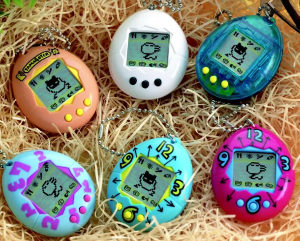
Tamagotchi Nest
In Make Things Engaging, KEES OVERBEEKE, TOM DJAJADININGRAT, CAROLINE HUMMELS, STEPHAN WENSVEEN AND JOEP FRENS write that:
“Aesthetic interaction requires richness that covers all the senses. Not only does it refer to richness in visual aspects of the product, but the wealth and subtlety of auditory, olfactory, flavoury, tactile and kinaesthetic aspects during interaction, are at least as important to achieve a beautiful interaction and an engaging experience.”
An engaging experience with technology must play on all of the human senses that it can. I used this information in each project that I approached this semester.
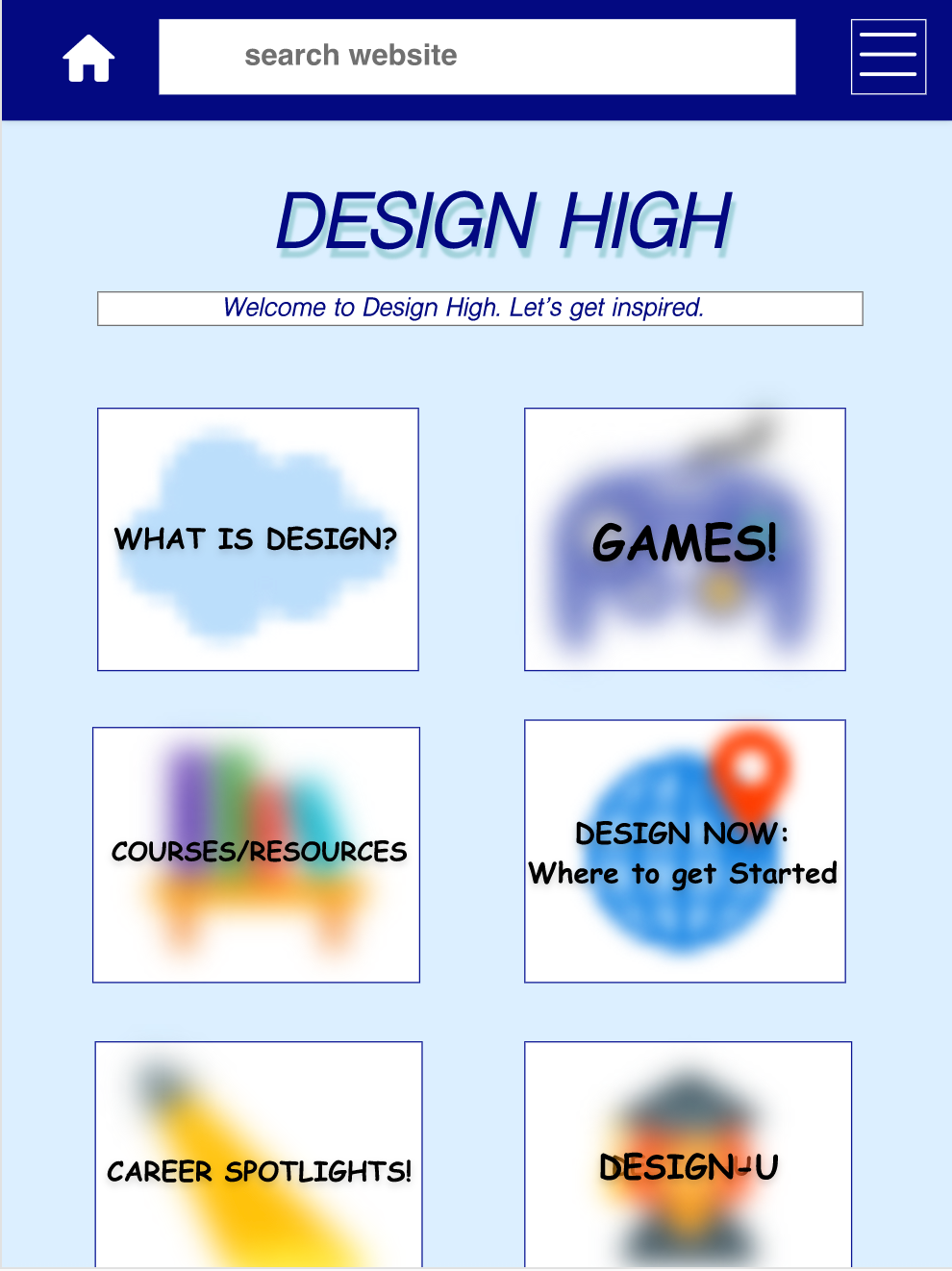
When making a website/application, I considered Gestalt Principles such as Similarity, Continuation, and Closure to make my User Interfaces pleasurable to look at.

When working with VR, I considered the imperative Role of the Ground in the implementation of our magic carpet and the use of haptics in the form of rotating planets, floating characters, and moving sounds to ensure a pleasurable, grounded experience rather than one that could quite possibly be uninteresting, or worse, sickening.
This principle comes into play no matter what you are making, no matter how utilitarian you many think your product is. If you are creating an ATM machine, consider the feel of the buttons under your users’ fingertips and the sounds that the on-screen interactions produce. Humans enjoy immersive experiences, and as computer scientists (designers of the technological world), it is our job to give it to them.
5. Design is a Team Sport: Communication and Inclusion are Key

Diversify Your Network
Just as we must get to know our users in order to produce groundbreaking/enjoyable products, we must also get to know our colleagues and ourselves. Especially in this new, virtual age of Zoom meetings, it is more difficult than ever to connect and communicate our ideas. Throughout the various projects in HCI this semester, my groups ran into a wide variety of communication issues. My reflections on my different groups’ work-styles throughout the semester included the following comments:
I wonder how we could have more open conversations about what we like/dislike about each other’s designs without worrying about critique or hurting feelings. I think that we were a bit afraid to critique each other’s design choices.
I wish that we had been more organized/clear about how we were splitting up the work from the beginning.
I wish we tackled problems together more. It was nice knowing distinctly what was expected of us but I would enjoy working on a team in which we circle back and face challenges together. I felt this kind of pressure that I needed to figure things out on my own and deliver for the group (which is maybe a pressure I just put on myself, but I thought it was worth noting).
I think there was a lack of communication in what we actually were going to get done/wanted from the beginning. In the end it was getting too close to the deadline so I just did it all.
Sometimes, a lack of communication paired with unclear expectations/guidelines within the group lead to uneven distributions of work. Other times, when work distributions and deadlines were super clear and distinct, it was hard for members to voice opinions/needs because our contributions were so separate.

Online Communication is Hard!
Much like every user’s story matters, every team member’s story matters. Good design is a team sport. And, as countless studies have now confirmed, diversity amongst developers is crucial to creating innovative ideas and catching one another’s flaws/missed-opportunities. We must work with those who see life and computers differently than we do in order to broaden our scope of possibilities and problem solving.
Conclusion
Design for Human Computer Interaction is a special intersection because technology is so instrumental in our every day lives at the same time as it is completely juxtaposed with natural human existence/interaction. By utilizing the design principles above and always remembering to design with fearlessness, empathy, creativity, insight, and communication, we can bridge the gap that separates technology from natural interactions. We can create visceral, authentic, pleasurable human-computer interactions that enhance our lives and our world. We can design for the future.